Typography
Typography is both an art and a technique that helps make written language more understandable, readable, and visually appealing.

What is typography ?
Typography is both an art and a technique that helps make written language more understandable, readable, and visually appealing. Good typography involves picking out the right typefaces, font sizes, line lengths, line-spacing, and letter-spacing, as well as adjusting the space in between pairs of letters. In addition to all of that, typography also refers to the style, arrangement, and overall appearance of the letters, numbers, and symbols that are created through this process.
The term typography is most typically associated with the style, arrangement, and appearance of the letters, numbers, and symbols created as a result of the printing process. However, it can also be used as an ornamental and decorative device unrelated to the communication of information. Type design is a closely related craft and some type designers do not consider themselves typographers.
Typography is the work of typesetters (also known as compositors), typographers, graphic designers, art directors, manga artists, comic book artists, and anyone who arranges words, letters, numbers, and symbols for publication, display, or distribution. Until the Digital Age, typography was a specialized occupation. Digitization opened up typography to new generations of previously unrelated designers and lay users.
As the ability to create typography has become more widespread, the use of principles and best practices developed by skilled workers and professionals over the years has decreased. As a result, at a time when scientific techniques can provide evidence to support established practice (legibility or brand recognition achieved through the appropriate use of serifs, letter case, letter forms, contrast, spacing, etc.), typography that fails to effectively communicate its message may be encountered more often.
The Evolution of Typography: A Brief History
Typography has an extensive and eventful history, which is why it's so important for graphic designers to have a comprehensive understanding of it. This is especially true for typeface designers who need to know about how typefaces have evolved over time in order to either incorporate or revive older styles, depending on what the project calls for. By having a keen knowledge of typography, designers can put a modern spin on even the oldest of typefaces.
Ancient Era
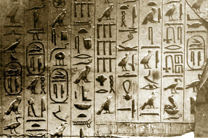
Ancient cave paintings are some of the first examples of written communication, dating back to 20,000 B.C. The first formal writing is said to have been developed by the Sumerians, at around 3,500 B.C. As civilizations advanced, there was a need to communicate more complex concepts—which led to the development of Egyptian hieroglyphics. By 3100 B.C., the Egyptians began using symbols or ideograms in their art, architecture, and writings.
The Middle Ages – Handwritten and Well-Illustrated Manuscripts
During the Middle Ages, most everything was handwritten - from letters to manuscripts - which then led to the emergence of different writing styles. Unicals (a type of script where all letters are written in capital letters) and half unicals (a type of script with some letters written in capitals and others in small letters) were popular, as well as rounded, elaborate lettering. Calligraphy was also a highly respected art form during this time, and calligraphy masters would often travel to different parts of the world to share their skills and knowledge with those who were considered to be part of the educated elite.

Gutenberg and Modern Typography
The Industrial Revolution saw a change in typography in order to communicate with a larger audience more effectively. Different typefaces were created that were more attention-grabbing and easy to read. This period also saw the development of new and experimental serif and sans serif typefaces. In addition, ornamental typography became popular during this time. The 1800s was a time when medieval art became more commonplace and international artistic styles developed significantly.

Present
Graphic designers today have an abundance of tools and technology at their disposal to create a wide variety of typographic styles, font families, and typefaces. With a solid understanding of typographic history, Graphic designers can broaden their skill set to produce more sophisticated work.
Typography is a huge and ever-growing field, which makes it impossible for graphic designers to be familiar with every single typeface design. However, it is important to be knowledgeable in various typographic styles, iconic typefaces, and the origins of common typefaces. This theoretical knowledge helps designers understand their clients’ needs more effectively and create design solutions that meet those needs.

Typography and Graphic Design
Typography is a crucial element of design that can really make a difference in how your work is perceived. Typography design, in particular, is a way for artists to use text as a means of communication, conveying a message about a company or brand. For graphic designers, this design aspect is important not just for creating an identity, but also for securing the interest of the audience, creating hierarchy, brand awareness, and unity, and defining the meaning and mood of the brand. You can learn more about typography in graphic design here.
Type Anatomy
Typography is an important aspect of design that goes deeper than just the different typefaces and fonts. While there are thousands of typefaces, each with their own distinctive characteristics, typography experts have given the various elements names and terminology. As a result, it is pivotal to learn typography design in order to produce excellent designs.
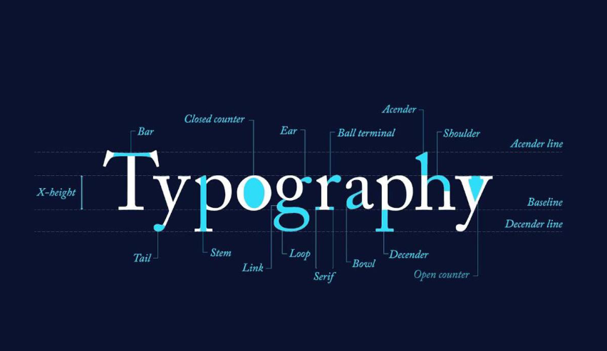
• X-height: The x-height is not necessarily a part but a calculation. This tests the height of all lowercase letters being part of the same typography design. It is called x-height since what defines the length is the letter x of each typeface.
• Cap height: The height of the cap is a measurement of all capital letters inside the same typeface. The most accurate representation can be used in flat-bottomed characters such as the letter E.
• Ascender: An ascender is a vertical stroke that stretches over x-height upwards.
• Descender: A descender is a vertical line running under the x-height.
• Stem: In erect characters, the stem is the central vertical stroke. When a letter contains no verticals, such as a capital A or V, the stem is called the first diagonal line.
• Stroke: A stroke is the main vertical diagonal line in a letter.
• Bar: A bar is a horizontal outline in letters such as A, H, e, and f.
• Serif: A serif is a narrow line at the beginning and end of strokes. Serifs are what give a serif or sans serif a typeface. The series can have different shapes: hairline, square/slab, and wedge. They may both be bracketed or un-bracketed, indicating their stroke relation is rounded or upright.
• Terminal: When a letter contains no serif, the end of the stroke is considered a terminal.
• Bowl: A bowl, as in the letters d, b, o, D and B, is a stroke that produces an enclosed curved area.
• Counter: The counter is the room filled with letters like o, b, d, and a. Counters are often produced via bowls. A link is a stroke that links the bowl and loop of a lowercase g on two accounts.
• Swash- A swash, of every capital letter used at the beginning of a paragraph, is an elegant or decorative alternative to a terminal or serif. The composition with swashes at the end of the lines is adorned. Calligraphy is full of swashes of all sorts, extending from ascenders at the top, bottom, and also in middle.
• Spur: A spur is a slight extension that drifts off the focal stroke on several capitals Gs.
• Typographic mastery requires commitment and a love for creativity and fantastic design. To grasp typography and enjoy it, you can spend some time studying the form of the past. It’s remarkable how many developments have been produced, throughout the history of type design and typesetting.
Types of Typography with examples
There are four main categories of typography: serif, sans serif, script, and decorative. Within each category, there are various sub-categories that help to further define and sort the different styles. Typographers and typography Saaz Studio Manish Nagar, Nagpur researchers have developed various schemes over the years to more accurately categorize styles.
Classifying typography can help you to better understand, mix, and match different styles. You can also learn about pagination styles here!
1.Serif Type Styles
These are the oldest and most common typography typefaces of different styles. This typeface has a feet-like design – a characteristic that makes it more legible, and at the same time carries a traditional atmosphere, reverence, comfort, and durability.
• Old Style
Examples: Adobe Jensen, Garamond, Goudy Old Style.
• Transitional
Examples: Baskerville, Perpetua
• Neoclassical & Didone
Examples: Bodoni Classic, ITC Fenice
• Slab Serifs
Examples: Museo Slab, Rockwell, American Typewriter
• Clarendon
Examples: Bookman, ITC Charter
• Glyphic
Examples: Albertus, Cartier Book, New text

Difference between Serif and Sans-Serof Fontsa
2. Sans Serif Type Styles
Although the serif typeface has feet, on the other side, sans-serif (where sans serif means “without serifs”) loses the adornments and feet that the serif has. This stirs feelings in the viewer about cleanliness, modernization, objectivity, and peace. However, different weights of this typeface can display various ambiances.
• Grotesque
Examples: Franklin Gothic, News Gothic.
• Neo-Grotesque
Examples: Helvetica, San Francisco, and Roboto
• Humanistic
Examples: Gill Sans, Verdana, Lucida Grande.
• Geometric
Examples: Futura, Avenir

Sans Serif Type Styles
3. Script Type Styles
Script typefaces show a similarity to handwriting as suggested by the term. It also provides an atmosphere of beauty, imagination and a girlish aura. Although the script typefaces are lovely, the use in print-outs and web documents on body text is not recommended. Two simple classifications exist: formal, and casual.
• Formal
Examples: Bickham Script, Snell Roundhand, Kuenstler Script.
• Casual
Examples: Brush Script, Bianca, Mahogany Script
• Calligraphic
Examples: Belltrap, Blaze, Vivaldi
• Blackletter & Lombardic
Examples: Goudy Text, Monmouth, Engravers Old English

Script Type style
4. Monospaced Type Styles
Each character takes up precisely the same amount of space on the page or screen. Smaller characters have more space across them to make up for the difference in width. Varieties include Serif and San Serif.
Examples: Courier New, Consolas, Source Code Pro

Monospaced Type Styles
5. Decorative Type Styles
The most visually striking fonts are expressive, special, welcoming, enjoyable, show typefaces. While most of this typeface ‘s styles are too difficult and decorative, there are those that are genuinely suitable for use as headers and titles.
Examples: Broadway, Cooper Black, Curlz

Decorative Type Styles
How to use typography in graphic design ?
Typography is a crucial aspect of graphic design, as it is the primary means of communication in most designs. Here are a few tips for using typography effectively in your designs:
1. Choose the right typeface: The typeface you choose will have a big impact on the overall look and feel of your design. Different typefaces convey different moods and tones, so be sure to choose one that matches the message you want to convey.
2. Create contrast: Contrast is important for making sure that your text is easy to read. You can create contrast by using different typefaces, sizes, or colors for different elements of your design.
3. Hierarchy: Hierarchy is the way that you arrange elements in your design to indicate their importance. By using different type sizes, colors, and weights, you can create a clear hierarchy that guides the viewer’s eye through the design.
4. Mind the spacing: The spacing between letters, words, and lines is also an important aspect of typography. Proper spacing can make text easier to read and improve the overall look and feel of your design.
5. Consider legibility: Keep in mind that the ultimate goal of typography is to be easily read and understood, so the typography should be easy to read and consistent in its style throughout the design.
6. Be mindful of the context: The typography you use and how you use it should be appropriate to the medium and context in which it is being used. A design for a website may be quite different than a design for a printed book or a sign.
Typefaces have their own unique positions and functions in the world of design, just like people have different roles to play in society. They can act as writers, creating narratives that will attract the interest of readers. However, it's important to think about appropriate placement before using a font in your design. You don't want to make any mistakes, so it's crucial that you understand digital fluency and its parameters before using typography in your work.